Thank you for taking the time to read through my blog and group blog and watching our final video, hope you enjoyed reading/watching them as much as I had making them!
You'll find all the appropriate links on the right hand column of this blog, along with all the appropriate labels to make my blog easier to read.
On this blog you will find all the research and planning I did at the beginning of this project, reflections during the production, and evaluation I did at the end. On the group blog you will find all the planning and production that we did as a group while making our video, album cover and website.
All my posts have been ordered chronologically, so it may be easier for you to start from my very first post and read them backwards, scrolling upwards instead downwards.
Thanks again,
Odelia Yu, Candidate No. 3920

Thursday, 15 December 2011
This blog is now closed!
The music video project has now come to a close, with all the appropriate tasks and blog posts finished. This project has probably been my favourite while studying media: we were allowed to shoot, lipsync, act like popstars, edit, make a website and album cover, all of which I have thoroughly enjoyed.
Thanks for viewing! :)
Thanks for viewing! :)
Wednesday, 14 December 2011
Evaluation: Question 4
4. How did you use new media technologies in the construction and research, planning and evaluation stages?
We used new media technologies throughout this project, using technologies that we had used previously, and some that we had never used before. We used different cameras compared to last year, and learnt how to use programmes such as Adobe After Effects and Wix. We also exploited the use of social media and web2.0, using websites such as Facebook, Twitter and Tumblr; all of which have been a lot of fun as we could roleplay as the band!
Research
For research we used the internet a lot, using websites such as YouTube and Google to look at real music videos, websites and album covers. YouTube was really helpful for research due to the related videos/suggestions on the side, meaning that we could watch similar videos/ videos in the same genre easily.
Planning
When planning our shoots, ideas and group meetings, we contacted eachother through Whatsapp, a new app on the iPhone, Blackberry and Android. This meant that we could have one group message and contact eachother immediately, on the go and for free. This was really effective as this made planning and communication much easier.

We also used Twitter and Twitlonger for planning, say if we needed to link eachother anything, or if an idea was really long (as it's faster to type on a keyboard than on a small phone). As girls who all use Twitter daily, this was also an effective and fast way of communication using new technology.

Construction
We used many different types of new technology for the production of our music video, during the shooting and editing stages. When shooting, we used a new camera, the Sony HDV 1080i 3CMOS for the first time, and also learnt how to use different types of lighting. For our narrative sequences we used floodlights and for our performance sequences we used the new lights in our Seward Studio at our school.
During the editing stages we used Adobe Premiere Pro CS4, similar to our project last year. However we also used Premiere to cut the song, which we didn't do last year. The original song was 3:46, but we were able to cut it seamlessly to make it 3:03, so that it would be the right length for our video.
After editing our whole sequence in Premiere, we decided that we wanted to colour grade it using After Effects. We learnt how to use Colour Finesse, Curves and Vignettes, shown in the video below:
We also used a lot of new technologies to create our ancillary texts; our website and album cover. To make our website, we used the programme Wix, something none of us had ever used before. Some of us had already had a little experience working with html on past blogs, but none of us had tried to create a website using Wix and flash. We found at first that Wix was great: we could easily add pages, text, images, links and videos. However, during the actual prcoess of making the website, we realised that it was not as easy to use as first presumed. Technical difficulties with the internet at our school meant that we always had to upload photos to image servers such as Tinypic and use the html to add photos to our website, and the desired effects and transitions were not always how we exactly wanted them to be.
However, by the end, we created a website we were all proud of. I personallu love the fact that Wix allowed us to add widgets to Twitter and easily create photo galleries, and the use of flash meant that we could create a moving enter page. I was especially happy with how we created a mailing list sign up (using a html we found from Google) and a working QR code. Below is a video of the QR code in use, and the mobile website we created to go with it, also made on Wix:
As mentioned before, we also created Twitter, Facebook and Tumblr accounts to make our band seem more real and further exploit the uses of web2.0 and social media. It was a lot of fun roleplaying as the band and making up fake stories; we even got a few bands and advertisers following our account!
Facebook: http://www.facebook.com/thexyzs
Twitter: http://twitter.com/#!/thexyzs
Tumblr: http://thexyzs.tumblr.com/

Making the album cover also allowed us to use new technology too. In all the previous years of using Photoshop to create images, we had always used CS4, but this year our school had recently installed CS5. There were new adjustment layers such as 'Vibrance' which I learnt to use, as well as learning about rulers and snap guides to help us lay out our digipacks. For example we used the guide lines (the blue lines, as shown below) which helped us with the layout of our album covers, as we were told no text was allowed to exceed them. This is because there was a high chance that the printer would cut them off, so it was better to keep inside them to be safe.

Photoshop allowed us to create real looking album covers easily, with adjustment layers such as curves, brightness/contrast, selective colour and gradient maps, some of which I had used before and some of which my classmates taught me how to use. The clone tool also came in handy to help to airbrush our faces and create that flawless popstar look, and various brushes helped us to create that rougher, edgier look we were going for.
We also used websites such as dafont and abstractfonts to download the right fonts that we wanted, including the barcode style font for 'Exhibit A' and the Dymo-label-style font for the track listing on the back.
Evaluation
To evaluate our project, we needed feedback from our audience. So to do this, we again exploited web2.0 and social networking. We created a survey, but unlike last year where we had a screening and handed out surveys that they could write on, we used new technology. This year, we created an online survey using SurveyMonkey, and then sent out the link of the survey and the YouTube video to our audience, via social networking sites such as Facebook, Twitter and Tumblr. We thought that this would be a better process as it was faster, more efficient, easy to use, and it meant that we could target a large reach in seconds.

We also used the website whatismyipaddress, which was very handy to see where the people who had taken our survey lived. From SurveyMonkey we could see the ip address of the person, which we then put into whatsmyipaddress and could find the city they came from. This was very useful to see where our audience had come from, and to see who we were targeting.
We could also see similar stats on YouTube, which showed us where in the world people had watched our video, and which audiences the video was most popular with.

We used new media technologies throughout this project, using technologies that we had used previously, and some that we had never used before. We used different cameras compared to last year, and learnt how to use programmes such as Adobe After Effects and Wix. We also exploited the use of social media and web2.0, using websites such as Facebook, Twitter and Tumblr; all of which have been a lot of fun as we could roleplay as the band!
Research
For research we used the internet a lot, using websites such as YouTube and Google to look at real music videos, websites and album covers. YouTube was really helpful for research due to the related videos/suggestions on the side, meaning that we could watch similar videos/ videos in the same genre easily.
Planning
When planning our shoots, ideas and group meetings, we contacted eachother through Whatsapp, a new app on the iPhone, Blackberry and Android. This meant that we could have one group message and contact eachother immediately, on the go and for free. This was really effective as this made planning and communication much easier.
We also used Twitter and Twitlonger for planning, say if we needed to link eachother anything, or if an idea was really long (as it's faster to type on a keyboard than on a small phone). As girls who all use Twitter daily, this was also an effective and fast way of communication using new technology.
Construction
We used many different types of new technology for the production of our music video, during the shooting and editing stages. When shooting, we used a new camera, the Sony HDV 1080i 3CMOS for the first time, and also learnt how to use different types of lighting. For our narrative sequences we used floodlights and for our performance sequences we used the new lights in our Seward Studio at our school.
During the editing stages we used Adobe Premiere Pro CS4, similar to our project last year. However we also used Premiere to cut the song, which we didn't do last year. The original song was 3:46, but we were able to cut it seamlessly to make it 3:03, so that it would be the right length for our video.
After editing our whole sequence in Premiere, we decided that we wanted to colour grade it using After Effects. We learnt how to use Colour Finesse, Curves and Vignettes, shown in the video below:
We also used a lot of new technologies to create our ancillary texts; our website and album cover. To make our website, we used the programme Wix, something none of us had ever used before. Some of us had already had a little experience working with html on past blogs, but none of us had tried to create a website using Wix and flash. We found at first that Wix was great: we could easily add pages, text, images, links and videos. However, during the actual prcoess of making the website, we realised that it was not as easy to use as first presumed. Technical difficulties with the internet at our school meant that we always had to upload photos to image servers such as Tinypic and use the html to add photos to our website, and the desired effects and transitions were not always how we exactly wanted them to be.
However, by the end, we created a website we were all proud of. I personallu love the fact that Wix allowed us to add widgets to Twitter and easily create photo galleries, and the use of flash meant that we could create a moving enter page. I was especially happy with how we created a mailing list sign up (using a html we found from Google) and a working QR code. Below is a video of the QR code in use, and the mobile website we created to go with it, also made on Wix:
As mentioned before, we also created Twitter, Facebook and Tumblr accounts to make our band seem more real and further exploit the uses of web2.0 and social media. It was a lot of fun roleplaying as the band and making up fake stories; we even got a few bands and advertisers following our account!
Facebook: http://www.facebook.com/thexyzs
Twitter: http://twitter.com/#!/thexyzs
Tumblr: http://thexyzs.tumblr.com/
Making the album cover also allowed us to use new technology too. In all the previous years of using Photoshop to create images, we had always used CS4, but this year our school had recently installed CS5. There were new adjustment layers such as 'Vibrance' which I learnt to use, as well as learning about rulers and snap guides to help us lay out our digipacks. For example we used the guide lines (the blue lines, as shown below) which helped us with the layout of our album covers, as we were told no text was allowed to exceed them. This is because there was a high chance that the printer would cut them off, so it was better to keep inside them to be safe.
Photoshop allowed us to create real looking album covers easily, with adjustment layers such as curves, brightness/contrast, selective colour and gradient maps, some of which I had used before and some of which my classmates taught me how to use. The clone tool also came in handy to help to airbrush our faces and create that flawless popstar look, and various brushes helped us to create that rougher, edgier look we were going for.
We also used websites such as dafont and abstractfonts to download the right fonts that we wanted, including the barcode style font for 'Exhibit A' and the Dymo-label-style font for the track listing on the back.
Evaluation
To evaluate our project, we needed feedback from our audience. So to do this, we again exploited web2.0 and social networking. We created a survey, but unlike last year where we had a screening and handed out surveys that they could write on, we used new technology. This year, we created an online survey using SurveyMonkey, and then sent out the link of the survey and the YouTube video to our audience, via social networking sites such as Facebook, Twitter and Tumblr. We thought that this would be a better process as it was faster, more efficient, easy to use, and it meant that we could target a large reach in seconds.
We also used the website whatismyipaddress, which was very handy to see where the people who had taken our survey lived. From SurveyMonkey we could see the ip address of the person, which we then put into whatsmyipaddress and could find the city they came from. This was very useful to see where our audience had come from, and to see who we were targeting.
We could also see similar stats on YouTube, which showed us where in the world people had watched our video, and which audiences the video was most popular with.
Evaluation: Question 3
3. What have you learned from your audience feedback?
After producing our video, we got audience feedback in a few different ways: via a premiere screening, a focus group, an online survey and social networking.
Premiere Screening
We first held a whole year premiere screening, showing all 6 music videos produced by our year, and invited as many Latymer students to come. We advertised the screening by word of mouth, sticking up posters around the school, putting up notices on our school's Intranet, setting up a Facebook event, and all of us stating it as our Facebook/ Twitter/ Blackberry Messenger statuses - any way that was possible!

Charley and Eoin also even created a short promo including clips from everyone's videos to give the audience a teaser and entice viewers to come to the screening, shown below:
Online Surveys and Social Networking:
After the screening, when the videos then got uploaded to YouTube, we decided to create an online survey using Survey Monkey, which we then sent to our target audience via social networking sites such as Facebook, Twitter and Tumblr. The survey consisted of 10 questions and is live at http://www.surveymonkey.com/s/QPQSL96.

The fact that we did it online it meant that we could reach a large audience and send it out to people all over the world. In fact, after going through the survey results we found that we could see the audience's IP addresses, and after using the website whatismyipaddress, we could see the city where they came from. The majority of the people who answered the survey was from London (as many of the people were our friends and classmates), but we also got a few answers from other cities such as Liverpool, Derby and Bedfordshire. We even got one result from Switzerland, and one from Canada!

After recieving our feedback, we found that overall we had done a pretty good job with our music video, with 100% of people saying that they could see it on a music channel, and a further 93.8% saying that they would like The XYZs if they were a real band. We asked a few open ended questions too, asking if they could briefly describe what happened in the video, what they thinked worked well, and what could be improved. From the 'what do you think went well' question, we got a lot of positive feedback, for example someone wrote: 'Definitily the gender roles and portrayals, I liked the fact the women were breaking stereotypes. I thought the editing was great, it set the pace and tone of the video. The whole mise en scene, use of colours and lighting also set the pace, tone and mood.' From this comment we could tell that the main concept of the video had been portrayed well, with the whole notion of girl power and challenging stereotypes. This was further shown in the 'can you briefly describe what you think happened in the video', with someone also writing 'The women carry on showing him they dont need his help but in the process humiliating him by taking his clothes painting his body, which i presume he thinks of it as 'flirting'. I get the representation and portrayal of powerful women and not needing the 'help' from a man.'
However, from the 'what could have been improved' question, we realised that the narrative could have been slightly more clearer: 'if there had to be something, then maybe a more developed story line could be an improvement.', 'Maybe make the storyline a bit clearer or add more of it compared to the performance.'
The majority of our audience understood the concept of girl power and feminism, but I understand where they are coming from, as the narrative is pretty cut up in our video, which could make it quite hard to follow.
Focus Groups:
We also had a focus group with the media students in our year, who could give us feedback from a media perspective. Again, the comments are positive on the whole but the place for improvement also lies with the narrative:
A few of the media students had raised an issue with the casting of Josh as the lead male in our video. They weren't sure that such a hot 'action hero' looking male should have been the lead, as the viewers were all attracted to him and wanted to see more of his topless shots. They thought that this was a distraction, and it would've been better if we had cast someone more 'slimy' or 'greasy', one which the audience wouldn't like. At the beginning of our project when we were thinking of casting, we decided that we wanted someone good looking but with the acting skills to act quite horrible, so that if we were to humiliate him the audience wouldn't feel too sorry for him. However from this feedback, maybe Josh was too good looking for the role in our video.
YouTube Statistics
We could also see important data about our video on YouTube, which produced maps and statistics of the viewers that watched our video.

As you can see from the diagram above, it is obvious that the main viewers of our video live in the UK, as presumed. There has also been a few viewings in countries such as America, Canada and Australia, which is understandable as they are all English speaking countries. What we didn't expect is that the age groups our video was most popular with was females ages 13-17, and males aged 35-54. The teenage female audience was the audience we were targeting, but the adult male audience was not, so this was a surprise.
It was also great to see that we had 15 likes and no dislikes, showing that we had created an effective video, targeting the right audience. This was reinforced by a comment we had recieved, shown below:

After producing our video, we got audience feedback in a few different ways: via a premiere screening, a focus group, an online survey and social networking.
Premiere Screening
We first held a whole year premiere screening, showing all 6 music videos produced by our year, and invited as many Latymer students to come. We advertised the screening by word of mouth, sticking up posters around the school, putting up notices on our school's Intranet, setting up a Facebook event, and all of us stating it as our Facebook/ Twitter/ Blackberry Messenger statuses - any way that was possible!
Charley and Eoin also even created a short promo including clips from everyone's videos to give the audience a teaser and entice viewers to come to the screening, shown below:
Online Surveys and Social Networking:
After the screening, when the videos then got uploaded to YouTube, we decided to create an online survey using Survey Monkey, which we then sent to our target audience via social networking sites such as Facebook, Twitter and Tumblr. The survey consisted of 10 questions and is live at http://www.surveymonkey.com/s/QPQSL96.
The fact that we did it online it meant that we could reach a large audience and send it out to people all over the world. In fact, after going through the survey results we found that we could see the audience's IP addresses, and after using the website whatismyipaddress, we could see the city where they came from. The majority of the people who answered the survey was from London (as many of the people were our friends and classmates), but we also got a few answers from other cities such as Liverpool, Derby and Bedfordshire. We even got one result from Switzerland, and one from Canada!
After recieving our feedback, we found that overall we had done a pretty good job with our music video, with 100% of people saying that they could see it on a music channel, and a further 93.8% saying that they would like The XYZs if they were a real band. We asked a few open ended questions too, asking if they could briefly describe what happened in the video, what they thinked worked well, and what could be improved. From the 'what do you think went well' question, we got a lot of positive feedback, for example someone wrote: 'Definitily the gender roles and portrayals, I liked the fact the women were breaking stereotypes. I thought the editing was great, it set the pace and tone of the video. The whole mise en scene, use of colours and lighting also set the pace, tone and mood.' From this comment we could tell that the main concept of the video had been portrayed well, with the whole notion of girl power and challenging stereotypes. This was further shown in the 'can you briefly describe what you think happened in the video', with someone also writing 'The women carry on showing him they dont need his help but in the process humiliating him by taking his clothes painting his body, which i presume he thinks of it as 'flirting'. I get the representation and portrayal of powerful women and not needing the 'help' from a man.'
However, from the 'what could have been improved' question, we realised that the narrative could have been slightly more clearer: 'if there had to be something, then maybe a more developed story line could be an improvement.', 'Maybe make the storyline a bit clearer or add more of it compared to the performance.'
The majority of our audience understood the concept of girl power and feminism, but I understand where they are coming from, as the narrative is pretty cut up in our video, which could make it quite hard to follow.
Focus Groups:
We also had a focus group with the media students in our year, who could give us feedback from a media perspective. Again, the comments are positive on the whole but the place for improvement also lies with the narrative:
A few of the media students had raised an issue with the casting of Josh as the lead male in our video. They weren't sure that such a hot 'action hero' looking male should have been the lead, as the viewers were all attracted to him and wanted to see more of his topless shots. They thought that this was a distraction, and it would've been better if we had cast someone more 'slimy' or 'greasy', one which the audience wouldn't like. At the beginning of our project when we were thinking of casting, we decided that we wanted someone good looking but with the acting skills to act quite horrible, so that if we were to humiliate him the audience wouldn't feel too sorry for him. However from this feedback, maybe Josh was too good looking for the role in our video.
YouTube Statistics
We could also see important data about our video on YouTube, which produced maps and statistics of the viewers that watched our video.
As you can see from the diagram above, it is obvious that the main viewers of our video live in the UK, as presumed. There has also been a few viewings in countries such as America, Canada and Australia, which is understandable as they are all English speaking countries. What we didn't expect is that the age groups our video was most popular with was females ages 13-17, and males aged 35-54. The teenage female audience was the audience we were targeting, but the adult male audience was not, so this was a surprise.
It was also great to see that we had 15 likes and no dislikes, showing that we had created an effective video, targeting the right audience. This was reinforced by a comment we had recieved, shown below:
Monday, 12 December 2011
Evaluation: Question 2
2. How effective is the combination of your main product and ancillary texts?
When making our music video, website and album cover, we made sure that there was a high level of constant branding and synergy across all platforms, creating an effective campaign. The idea of constant branding and a strong artist identity was key for this project, as we were making a debut music video and debut album, meaning that the artist identity had to come across to the audience as heavy as possible.

Branding, colour schemes and style:
We used a constant colour scheme across all platforms, especially for our websites and social media sites. We kept a black/white/hotpink scheme across every page of our Wix website, and customised our Twitter and Tumblr to keep with the theme. We decided on a black/white/pink scheme as the pink connotes the girliness of our band, but the contrast between the black and white shows our rockier side. We also found that this was the same colour scheme used by The Veronicas, who also kept the same black/white/pink across their website and all their CD covers.

On all of the pages we also added the 'The XYZs' logo, to make sure our branding came across as forcefully as possible, and so that everyone would be able to remember our band. The logo was used on everything that we made: our website, album cover, merchandise, tour posters, Twitter backgrounds...etc. This was also shown through the video, as we also painted the 'The XYZs' logo onto the wall, using pink and black paint.
We decided to make our logo as simple and effective as possible; just the name of the band with a pink brush behind it. We liked the brush at the back because it looked a bit like a lipstick mark - showing our girlier side - but also looked like a paint mark, therefore linking our logo to our debut music video.

During the post-production process, we also decided to colour grade our music video using Adobe After Effects. We had decided on a pink/magenta tint on all the performance shots, to enhance the pink from the 'The XYZs' logo that we had painted behind. This again matches the colour scheme that we had on our website (there wasn't a lot of dark black in the video like the website however, but we brought out the pinks to make it match as much as possible).

We also used curves and ProcAmp in After Effects and Premiere Pro to make the video more contrasted, striking and edgy. This also matches all the photos on our gallery of our website and our album cover. We decided to make all of our photos and shots as contrasted as possible (without making it look too overly edited) to connote that rocky, edgy look we were going for, which was also reflected in the styling.
The clothes that we were wore during the video was also the same outfit that we wore on our front cover of our album, as we did an on-set photoshoot after the performance shoot. At first we didn't want to use these images for the front cover as we thought we wanted something different, so at first we used photos from our second promo shoot. We created a draft front cover with the album name 'Material Command', as shown below:

However, after looking at this cover for a while and getting feedback from teachers, we decided that it didn't go well with the music video and didn't connote the exact right image we had in mind. It did show us as a slightly rocky girlband with the predominance of black and the smashed glass in the background, but we decided it looked more similar to something of The Saturdays than The Veronicas. We thought the styling was a bit too feminine and classy, and we wanted something more rocky with an image showing the girls with their guitar and bass. We also decided to change the name from 'Material Command' to 'Exhibit A' as we thought 'Material Command' was again too girly, with people linking the title to 'Material Girl'. We found that 'Exhibit A' sounded more rocky with the connotations of being rebellious, and the fact that it was 'A' reflects the letters used in our band name 'The XYZs'. The final CD cover we thought matched our campaign a lot better, with the same iconography and motifs as the music video, and styling as the website.

On top of making the ancillary website and album cover, we also decided to make a perfume advert. We made The XYZs brand ambassadors of the new fragrance LOUD by Tommy Hilfiger. We thought that this was a perfect fit: the colour scheme for the advert was black/white/pink, the bottle was the same hot pink we had used for all our products, and the name was called LOUD, connoting music. The fragrance is aimed at teenagers/young adults who are 'loud', free and willing to express themselves, similar to the image of Daisy Lowe used in the advert. We thought that this was a lot like The XYZs and their targeted audience: The XYZs are a teenage pop/glamrock/techno girlband who aren't afraid of speaking out and promoting controversial topics such as feminism and girl power in their videos.
We then decided to incorporate the fragrance into a competition on The XYZs website, where contestants could make videos and then tweet their entries with the hashtags and mentions #XYZLOUD, @TheXYZs and @LOUD_Hilfiger, promoting both brands, making it a mutually advantageous campaign.
We also further developed this idea of being brand ambassadors for Tommy Hilfiger, and subtly promoted the brand in our video with Charley/Xanthe wearing a Tommy Hilfiger pair of dungarees during the narrative sequence.

Working together as a package/interactivity:
As a package, all the products work well together, with the ancillary texts referring to eachother. For example on the album cover there are the links to the websites (The XYZs official website and the Walkout Records website), and on the wix website there is a large image on the album cover, and also a link to the Walkout Recrods website. Plus, we used the same QR code on both the website and album cover, therefore bringing the audience to the same page on there phone, whether they used the album or website. The website acts like a hub with links to everything that we have made; including the album, the music video, the behind the scenes video and the cut version of our song.

The interactivity on the website is high, with the audience allowed to click through the website easily at their own will, watch our videos, listen to the music, sign up, purchase merchandise and enter the competition. As mentioned before, we also created accounts on the social networking sites Twitter, Facebook and Tumblr, all of which too are easy to access. This shows that all the websites that we created on the internet also work well as a package, with all of them linking up easily. For example on the official Tumblr, there are links just below the header to both our Facebook and Twitter accounts. All of the accounts also post the same information, for example they all posted the behind the scenes and the final video for audiences to view.

When making our music video, website and album cover, we made sure that there was a high level of constant branding and synergy across all platforms, creating an effective campaign. The idea of constant branding and a strong artist identity was key for this project, as we were making a debut music video and debut album, meaning that the artist identity had to come across to the audience as heavy as possible.
Branding, colour schemes and style:
We used a constant colour scheme across all platforms, especially for our websites and social media sites. We kept a black/white/hotpink scheme across every page of our Wix website, and customised our Twitter and Tumblr to keep with the theme. We decided on a black/white/pink scheme as the pink connotes the girliness of our band, but the contrast between the black and white shows our rockier side. We also found that this was the same colour scheme used by The Veronicas, who also kept the same black/white/pink across their website and all their CD covers.
On all of the pages we also added the 'The XYZs' logo, to make sure our branding came across as forcefully as possible, and so that everyone would be able to remember our band. The logo was used on everything that we made: our website, album cover, merchandise, tour posters, Twitter backgrounds...etc. This was also shown through the video, as we also painted the 'The XYZs' logo onto the wall, using pink and black paint.
We decided to make our logo as simple and effective as possible; just the name of the band with a pink brush behind it. We liked the brush at the back because it looked a bit like a lipstick mark - showing our girlier side - but also looked like a paint mark, therefore linking our logo to our debut music video.
During the post-production process, we also decided to colour grade our music video using Adobe After Effects. We had decided on a pink/magenta tint on all the performance shots, to enhance the pink from the 'The XYZs' logo that we had painted behind. This again matches the colour scheme that we had on our website (there wasn't a lot of dark black in the video like the website however, but we brought out the pinks to make it match as much as possible).
We also used curves and ProcAmp in After Effects and Premiere Pro to make the video more contrasted, striking and edgy. This also matches all the photos on our gallery of our website and our album cover. We decided to make all of our photos and shots as contrasted as possible (without making it look too overly edited) to connote that rocky, edgy look we were going for, which was also reflected in the styling.
The clothes that we were wore during the video was also the same outfit that we wore on our front cover of our album, as we did an on-set photoshoot after the performance shoot. At first we didn't want to use these images for the front cover as we thought we wanted something different, so at first we used photos from our second promo shoot. We created a draft front cover with the album name 'Material Command', as shown below:
However, after looking at this cover for a while and getting feedback from teachers, we decided that it didn't go well with the music video and didn't connote the exact right image we had in mind. It did show us as a slightly rocky girlband with the predominance of black and the smashed glass in the background, but we decided it looked more similar to something of The Saturdays than The Veronicas. We thought the styling was a bit too feminine and classy, and we wanted something more rocky with an image showing the girls with their guitar and bass. We also decided to change the name from 'Material Command' to 'Exhibit A' as we thought 'Material Command' was again too girly, with people linking the title to 'Material Girl'. We found that 'Exhibit A' sounded more rocky with the connotations of being rebellious, and the fact that it was 'A' reflects the letters used in our band name 'The XYZs'. The final CD cover we thought matched our campaign a lot better, with the same iconography and motifs as the music video, and styling as the website.
On top of making the ancillary website and album cover, we also decided to make a perfume advert. We made The XYZs brand ambassadors of the new fragrance LOUD by Tommy Hilfiger. We thought that this was a perfect fit: the colour scheme for the advert was black/white/pink, the bottle was the same hot pink we had used for all our products, and the name was called LOUD, connoting music. The fragrance is aimed at teenagers/young adults who are 'loud', free and willing to express themselves, similar to the image of Daisy Lowe used in the advert. We thought that this was a lot like The XYZs and their targeted audience: The XYZs are a teenage pop/glamrock/techno girlband who aren't afraid of speaking out and promoting controversial topics such as feminism and girl power in their videos.
We then decided to incorporate the fragrance into a competition on The XYZs website, where contestants could make videos and then tweet their entries with the hashtags and mentions #XYZLOUD, @TheXYZs and @LOUD_Hilfiger, promoting both brands, making it a mutually advantageous campaign.
We also further developed this idea of being brand ambassadors for Tommy Hilfiger, and subtly promoted the brand in our video with Charley/Xanthe wearing a Tommy Hilfiger pair of dungarees during the narrative sequence.
Working together as a package/interactivity:
As a package, all the products work well together, with the ancillary texts referring to eachother. For example on the album cover there are the links to the websites (The XYZs official website and the Walkout Records website), and on the wix website there is a large image on the album cover, and also a link to the Walkout Recrods website. Plus, we used the same QR code on both the website and album cover, therefore bringing the audience to the same page on there phone, whether they used the album or website. The website acts like a hub with links to everything that we have made; including the album, the music video, the behind the scenes video and the cut version of our song.
The interactivity on the website is high, with the audience allowed to click through the website easily at their own will, watch our videos, listen to the music, sign up, purchase merchandise and enter the competition. As mentioned before, we also created accounts on the social networking sites Twitter, Facebook and Tumblr, all of which too are easy to access. This shows that all the websites that we created on the internet also work well as a package, with all of them linking up easily. For example on the official Tumblr, there are links just below the header to both our Facebook and Twitter accounts. All of the accounts also post the same information, for example they all posted the behind the scenes and the final video for audiences to view.
Evaluation: Question 1
1. In what ways does your media product use, develop or challenge forms and conventions of real media products?
I think our final music video uses, develops and challenges forms and conventions of real music videos; following the rules of music video editing, and with inspiration from real music videos, tv programmes and films.
The notion of feminism in our video:
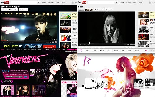
The first real media product we could compare our product to was the original music video for the song Stripper by Soho Dolls. As we can see from the real music video, we have completely changed the concept of the video, with the male being the stripper instead of the females. Here we have shown how we have challenged conventions of music videos, as it is usually females which are viewed in a sexualised way, wearing skimpy clothes which bare a lot of skin (as mentioned in this previous post). We promoted a feministic view, with our narrative connoting the storyline of 'don't stare at us as if we are sexual objects, or we will get you back'.
There have also been a few music videos in the industry which promote feminism, such as Stupid Girls - Pink and Misery - Maroon 5, which we could draw inspiration from.

We also drew inspiration from this clip from Charlie's Angles: Full Throttle, where the girls use their sexuality and use the man in the situation. Our video was not as raunchy and over-sexualised as this clip, but the idea is similar; with our video showing the three girls painting and flirting with the man who is staring at them, and getting him back at the end:
Analysing our video according to Goodwin:
Our video completely follows the rules and conventions of Goodwin's music video analysis, with our strong notion of looking and voyeurism. The song itself has the line 'You like me to stare? I am a voyeur', and we played off this theme. Our video shows the male staring at the girls and then rubbing his hands, and we deliberately placed these shots during the second half of the first verse, where it matches the lyrics of the song: 'Don't touch the girls, Don't kiss the girls, I have the right to pull the girls... But I wanna touch, And I wanna kiss, And if you say no then I will persist'. This also shows that we followed Goodwin's convention of illustrating the relationship between the lyrics and visuals.

We also have many close up 'beauty shots' and 'money shots' of the band, during both the performance and narrative. These shots would be parts of the demands of the record label if this video were real, as the label would insist on visual hooks and motifs to show the artist identity. In our video we have a lot of close ups on the bands' faces, and also on their hands while they play the guitar. All the close ups were brightly lit and the girls all wore a lot of make up to connote the perfection of girlbands, and make their audience almost want to be them. The close ups on the guitar playing also show the artist identity; The XYZs are not just a stereotypical girlband; they rock and are 'girls with guitars'. This image has also been used across all platforms, with our album cover and website gallery also including pictures showing the guitar playing.

Our video also comes under the categories of both performance and narrative, with it being split almost half/half according to screentime. This follows the convention of many music videos, with split performance/narrative music videos, again following Goodwin's analysis.
There are also quite a few intertextual references to films, TV programmes and other music videos. As stated above, we took inspiration and referenced Charlie's Angels, but also the music video for Bitch - Plasticines, and also Gossip Girl. We looked at the band Plasticines a lot for inspiration as they are not the most conventional pop girl group but are more of a cooler all-girl band, something we wanted The XYZs to be. In their video for Bitch we see the girls writing the word 'Bitch' on the floor, advertising and promoting their single, and in our video we paint 'The XYZs' on the wall, advertising and promoting our band.

We also slightly reference Gossip Girl, with a dance move at the beginning of the video. As stated in a previous post, we first heard the song Stripper from an episode of Gossip Girl, where the character Blair Waldorf dances in a strip club. So to give a small recognition and salute, I took a small dance move from the episode and put it in our video.

Analysing our video according to Vernallis:
Our video also fits with Vernallis's conventions, especially in the editing of our video. Vernallis states that the editing in a music video breaks all rules of continuity editing, which we used in our video. We edited breaking the 30 degree rule and used jump cuts, and we also cut two extreme shots together on many occassions.
Our editing also matched musical phrases and the beat, and editing was also foregrounded at points, especially when we made some of the shots black and white.

However we slightly challenge Vernallis's narrative conventions, following a more filmic form. Vernallis states that the narrative doesn't normally have a clear resolution or ending, but in our video however, we do. Our video ends with the girls running out and leaving the male alone in his underwear and socks, showing a clear ending the audience should be able to understand.
----------------------------------------------------------------------------------

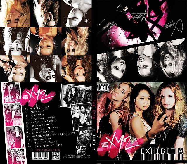
Our album cover:
The album cover for The XYZ's 'Exhibit A' also follows all the forms and conventions as real album covers, with all the essential points. The front of the cover is a large picture of the band, with the band logo and album cover written in large. The image on the front shows the girls holding a guitar, bass and microphone, again showing the 'girls with guitars' look, further emphasising that we are not you average girl group like The Saturdays or Girls Aloud as we play our instruments. This makes our album cover similar to the album covers shown below: Miley Cyrus - Time Of Our Lives, Plastiscines - Plastiscines, Orianthi - Believe, as these album covers all have the artist with their microphone/guitar.

As our cover shows a lot about our band, this follows the conventions of album covers, as the image on the front of an album cover should be striking and show the artist identity.
The back also follows all the rules and conventions too, with all the essential information: track listing, barcodes, institutional information and websites.
----------------------------------------------------------------------------------

Our website:
The website we made for The XYZs also followed all the forms and conventions of real music websites. We made all the appropriate pages; home, the band, gallery, tour, listen, watch, win and merch. As we previously saw on websites, the home generally was set up in columns with news, a twitter feed, facebook links, opportunities to join the mailing list and buy the music. All the websites also had links to other sites on the bottom or top of all the pages, which we also did, with links to YouTube, Spotify, Tumblr, Facebook, Twitter and a mobile site we also created.
Every page had the navigation bar, logo, links at the bottom and information on the label, similar to real websites. We also kept a constant black/white/pink colour scheme running throughout, as well as only the same few different fonts used for every page.
However, we did challenge the conventions by using Wix, a flash site generator. After looking at many different websites online, we couldn't find any flash websites which were fixed at the same size on every page like ours; all the websites we could find were scroll. The closest website we could find was Rihanna's website which had flash on the front page, where the images and links changed every few seconds:

I think our final music video uses, develops and challenges forms and conventions of real music videos; following the rules of music video editing, and with inspiration from real music videos, tv programmes and films.
The notion of feminism in our video:
The first real media product we could compare our product to was the original music video for the song Stripper by Soho Dolls. As we can see from the real music video, we have completely changed the concept of the video, with the male being the stripper instead of the females. Here we have shown how we have challenged conventions of music videos, as it is usually females which are viewed in a sexualised way, wearing skimpy clothes which bare a lot of skin (as mentioned in this previous post). We promoted a feministic view, with our narrative connoting the storyline of 'don't stare at us as if we are sexual objects, or we will get you back'.
There have also been a few music videos in the industry which promote feminism, such as Stupid Girls - Pink and Misery - Maroon 5, which we could draw inspiration from.
We also drew inspiration from this clip from Charlie's Angles: Full Throttle, where the girls use their sexuality and use the man in the situation. Our video was not as raunchy and over-sexualised as this clip, but the idea is similar; with our video showing the three girls painting and flirting with the man who is staring at them, and getting him back at the end:
Analysing our video according to Goodwin:
Our video completely follows the rules and conventions of Goodwin's music video analysis, with our strong notion of looking and voyeurism. The song itself has the line 'You like me to stare? I am a voyeur', and we played off this theme. Our video shows the male staring at the girls and then rubbing his hands, and we deliberately placed these shots during the second half of the first verse, where it matches the lyrics of the song: 'Don't touch the girls, Don't kiss the girls, I have the right to pull the girls... But I wanna touch, And I wanna kiss, And if you say no then I will persist'. This also shows that we followed Goodwin's convention of illustrating the relationship between the lyrics and visuals.
We also have many close up 'beauty shots' and 'money shots' of the band, during both the performance and narrative. These shots would be parts of the demands of the record label if this video were real, as the label would insist on visual hooks and motifs to show the artist identity. In our video we have a lot of close ups on the bands' faces, and also on their hands while they play the guitar. All the close ups were brightly lit and the girls all wore a lot of make up to connote the perfection of girlbands, and make their audience almost want to be them. The close ups on the guitar playing also show the artist identity; The XYZs are not just a stereotypical girlband; they rock and are 'girls with guitars'. This image has also been used across all platforms, with our album cover and website gallery also including pictures showing the guitar playing.
Our video also comes under the categories of both performance and narrative, with it being split almost half/half according to screentime. This follows the convention of many music videos, with split performance/narrative music videos, again following Goodwin's analysis.
There are also quite a few intertextual references to films, TV programmes and other music videos. As stated above, we took inspiration and referenced Charlie's Angels, but also the music video for Bitch - Plasticines, and also Gossip Girl. We looked at the band Plasticines a lot for inspiration as they are not the most conventional pop girl group but are more of a cooler all-girl band, something we wanted The XYZs to be. In their video for Bitch we see the girls writing the word 'Bitch' on the floor, advertising and promoting their single, and in our video we paint 'The XYZs' on the wall, advertising and promoting our band.
We also slightly reference Gossip Girl, with a dance move at the beginning of the video. As stated in a previous post, we first heard the song Stripper from an episode of Gossip Girl, where the character Blair Waldorf dances in a strip club. So to give a small recognition and salute, I took a small dance move from the episode and put it in our video.
Analysing our video according to Vernallis:
Our video also fits with Vernallis's conventions, especially in the editing of our video. Vernallis states that the editing in a music video breaks all rules of continuity editing, which we used in our video. We edited breaking the 30 degree rule and used jump cuts, and we also cut two extreme shots together on many occassions.
Our editing also matched musical phrases and the beat, and editing was also foregrounded at points, especially when we made some of the shots black and white.
However we slightly challenge Vernallis's narrative conventions, following a more filmic form. Vernallis states that the narrative doesn't normally have a clear resolution or ending, but in our video however, we do. Our video ends with the girls running out and leaving the male alone in his underwear and socks, showing a clear ending the audience should be able to understand.
----------------------------------------------------------------------------------
Our album cover:
The album cover for The XYZ's 'Exhibit A' also follows all the forms and conventions as real album covers, with all the essential points. The front of the cover is a large picture of the band, with the band logo and album cover written in large. The image on the front shows the girls holding a guitar, bass and microphone, again showing the 'girls with guitars' look, further emphasising that we are not you average girl group like The Saturdays or Girls Aloud as we play our instruments. This makes our album cover similar to the album covers shown below: Miley Cyrus - Time Of Our Lives, Plastiscines - Plastiscines, Orianthi - Believe, as these album covers all have the artist with their microphone/guitar.
As our cover shows a lot about our band, this follows the conventions of album covers, as the image on the front of an album cover should be striking and show the artist identity.
The back also follows all the rules and conventions too, with all the essential information: track listing, barcodes, institutional information and websites.
----------------------------------------------------------------------------------
Our website:
The website we made for The XYZs also followed all the forms and conventions of real music websites. We made all the appropriate pages; home, the band, gallery, tour, listen, watch, win and merch. As we previously saw on websites, the home generally was set up in columns with news, a twitter feed, facebook links, opportunities to join the mailing list and buy the music. All the websites also had links to other sites on the bottom or top of all the pages, which we also did, with links to YouTube, Spotify, Tumblr, Facebook, Twitter and a mobile site we also created.
Every page had the navigation bar, logo, links at the bottom and information on the label, similar to real websites. We also kept a constant black/white/pink colour scheme running throughout, as well as only the same few different fonts used for every page.
However, we did challenge the conventions by using Wix, a flash site generator. After looking at many different websites online, we couldn't find any flash websites which were fixed at the same size on every page like ours; all the websites we could find were scroll. The closest website we could find was Rihanna's website which had flash on the front page, where the images and links changed every few seconds:
Subscribe to:
Posts (Atom)